We all agree that in order for an ad to be effective, it must first be seen or read. Verso and HarperCollins had a unique opportunity to learn, through the magic of actual consumer research, just what kind of impact a specific print ad had on readers.
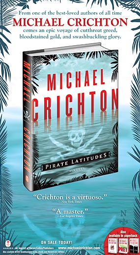
On December 9, 2009 HarperCollins ran a full page four color ad for Michael Crichton’s novel Pirate Latitudes in The Wall Street Journal. As luck would have it, the ad was running in an issue that had been designated a “Starch” issue. Simply put, this meant that our ad would be part of a consumer survey conducted by Starch Research in which Journal readers who agreed to cooperate would be asked about their reactions to each of the ads in the designated issue. It is not often that we are able to participate in this kind of study and so we anxiously looked forward to what might be revealed to us. As it turned out we had to wait a couple of months for the completion of interviews and compilation of the information, but we were delighted with the results.
Out of the 51 ads in that day’s paper, the one for Pirate Latitudes ranked
#19 in the category of “remembered the ad on their own and commented on it.” This put us 10% above index (110). Not bad. But as the interviews focused more intently on the content of the ad, Pirate Latitudes pulled ahead of the pack. In the area of “Read Some” (people interviewed who read any part of the ad’s copy) we indexed 121, the fourth highest rank among all the advertisers. And in “Read Most” (people interviewed who read half or more of the written material in the ad) we indexed 121 for a ranking of number 2!
But what made the study even more interesting were the reader comments. When asked “Which ad was your favorite and why?” the Harper ad received accolades! Herewith a sampling:
“It’s a great ad and a great author. The color stands out…the bold print is easy to read.”
“It’s big and colorful. The book must be a good read!”
The lesson seems to be that the best way to get the notice of consumers in print is with compelling graphics and engaging copy, and that in a world full of products vying for our attention this is how we might have an impact on the decisions of potential purchasers. Book publishers, after all, excel at giving readers a deeply satisfying immersive experience. Their print ads should aim for the deepest level of reader engagement as well.
By Michael Kazan
![]() #f8981d" title="PirateLatitudes" src="http://www.versoadvertising.com/inverso/wp-content/uploads/2010/04/PirateLatitudes.jpg" alt="PirateLatitudes" width="285" height="518" srcset="https://www.versoadvertising.com/inverso/wp-content/uploads/2010/04/PirateLatitudes.jpg 285w, https://www.versoadvertising.com/inverso/wp-content/uploads/2010/04/PirateLatitudes-165x300.jpg 165w" sizes="(max-width: 285px) 100vw, 285px" />We all agree that in order for an ad to be effective, it must first be seen or read. Verso and HarperCollins had a unique opportunity to learn, through the magic of actual consumer research, just what kind of impact a specific print ad had on readers.
#f8981d" title="PirateLatitudes" src="http://www.versoadvertising.com/inverso/wp-content/uploads/2010/04/PirateLatitudes.jpg" alt="PirateLatitudes" width="285" height="518" srcset="https://www.versoadvertising.com/inverso/wp-content/uploads/2010/04/PirateLatitudes.jpg 285w, https://www.versoadvertising.com/inverso/wp-content/uploads/2010/04/PirateLatitudes-165x300.jpg 165w" sizes="(max-width: 285px) 100vw, 285px" />We all agree that in order for an ad to be effective, it must first be seen or read. Verso and HarperCollins had a unique opportunity to learn, through the magic of actual consumer research, just what kind of impact a specific print ad had on readers.
On December 9, 2009 HarperCollins ran a full page four color ad for Michael Crichton’s novel Pirate Latitudes in The Wall Street Journal. As luck would have it, the ad was running in an issue that had been designated a “Starch” issue. Simply put, this meant that our ad would be part of a consumer survey conducted by Starch Research in which Journal readers who agreed to cooperate would be asked about their reactions to each of the ads in the designated issue. It is not often that we are able to participate in this kind of study and so we anxiously looked forward to what might be revealed to us. As it turned out, we had to wait a couple of months for the completion of interviews and compilation of the information, but we were delighted with the results.
Continue reading →